An Inventory Grid shows ItemInfo values from an Inventory in a fixed set of reusable slots. Use it for a Bag, shop stock, storage, or any view that may contain more Items than can be displayed at once.

For example, a 4-by-4 Bag can show Health Potion and Iron Sword, filter to Consumables or Weapons, and page through a larger Inventory without creating one Unity UI object for every Item. Selection, Item Actions, descriptions, and movement come from the shared Item View Slots Container workflow.

Before you begin

Confirm that:

  • the Inventory and its Bag collection already exist;
  • Health Potion and Iron Sword appear in that Inventory in Play Mode;
  • UI Designer Canvas Managers and a project-owned schema have been created; and
  • the Display Panel Manager has the correct Panel Owner or the Inventory has a unique Inventory Identifier ID.

An Inventory Grid starts from Inventory.AllItemInfos. Add an Item Collection filter when the panel should show Bag but not Equipment, Loadout, or another collection.

Create the grid or list

  1. Open Tools > Opsive > Ultimate Inventory System > UI Designer and select Inventory Grid.
  2. Choose a Panel Option. Simple is the default; Basic, Floating, and MainMenu are also supplied.
  3. Set Panel Name. The creator starts with My Inventory Grid Panel.
  4. Optionally assign Inventory. Leaving it empty lets the generated panel binding resolve its Inventory at runtime.
  5. Choose Grid Option:
    • Grid creates rows and columns. Grid Size defaults to 4 x 4 in UI Designer.
    • List creates a single column from the list schema. List Length defaults to 5.
  6. Set Inventory Grid Name, which defaults to Inventory Grid, then create the panel.

UI Designer creates the Display Panel, Inventory Grid, Item Info Grid, Grid Event System, Item View Drawer, Item View Slots, and Item View Slots Container Panel Binding. When an explicit Inventory is assigned, the creator also adds Inventory Grid Index Data to that Inventory if it is missing.

Understand the generated components

The grid uses a fixed number of Action Buttons equal to Grid Size. The Grid Event System reuses those buttons while the Item Info Grid changes which range of ItemInfo values they draw. Configure the size before Play Mode; the initialized grid does not rebuild its runtime slot count when Grid Size changes.

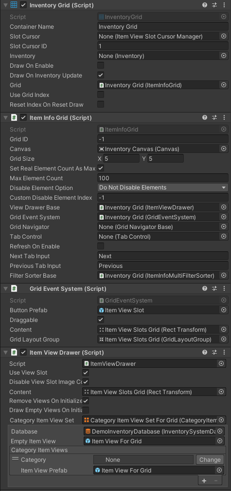
A configured Inventory Grid Inspector showing the Inventory Grid, Item Info Grid, Grid Event System, and Item View Drawer for a five-by-five grid.

Inventory Grid

In addition to the shared container fields, Inventory Grid adds:

Inspector field Default Purpose
Grid None Required Item Info Grid. The component looks on the same GameObject when this is unassigned.
Use Grid Index On Keeps Item Stacks at indexed visual positions and allows gaps.
Reset Index On Reset Draw Off Returns the visible range to index 0 when the panel performs a reset draw.
Remove Empty Indexes On Reset Draw Off Compacts stored visual positions during a reset draw.

Moving an Item between two positions in the same Inventory Grid changes the grid indexer’s visual order; it does not move the Item between Inventory collections. Transfers between Bag and Equipment require the movement/drop-action workflow.

Item Info Grid

The Item Info Grid controls the visible range and slot behavior:

Inspector field Default Purpose
Grid ID -1 Treats this grid as unique. A shared non-negative ID lets grids for the same Inventory and tab synchronize indexed positions.
Canvas None Canvas used by the grid; the parent Canvas is found during initialization.
Grid Size 5 x 4 on the component Number of reusable columns and rows. UI Designer overrides this with the creator choice.
Set Real Element Count As Max On Limits navigation to the filtered Item count.
Max Element Count 100 Navigation count used only when the real count is not the maximum.
Disable Element Option Do Not Disable Elements Controls whether unused slots remain active.
Custom Disable Element Index -1 Custom cutoff used by the matching disable options.
View Drawer Base None Required Item View Drawer that draws each slot.
Grid Event System None Required component that creates/listens to the fixed Action Buttons.
Grid Navigator None Optional paging, scroll-step, or scroll-view navigator.
Tab Control None Optional control used with Inventory tabs.
Select Button On Initialize On Selects local slot 0 when the grid initializes.
Refresh On Enable Off Does not refresh merely because the Item Info Grid component becomes enabled.
Next Tab Input Next Panel-owner input name for the next tab.
Previous Tab Input Previous Panel-owner input name for the previous tab.
Filter Sorter Base None Default ItemInfo filter/sorter bound at initialization.

The Grid Event System’s Draggable option is on by default, which forwards pointer drag events. It does not perform Inventory transactions by itself. Button Prefab must contain an Action Button, and Content must contain only compatible slot buttons for the configured size.

Bind the Inventory and Bag collection

The generated Item View Slots Container Panel Binding resolves its Inventory in this order: explicit Inventory, the Display Panel Manager’s Panel Owner when Bind To Panel Owner Inventory is enabled, then Bind To Inventory By Identifier when panel-owner binding is off.

After the owner is correct, decide which collections appear:

  • Use Item Info Item Collection Filter to show only Bag or to hide selected collections. Its Show Item Collections list shows every collection when empty; Hide Item Collections defaults to Loadout and Hide purposes.
  • Use Item Info Item Collection And Category Filter when category filtering should apply only to selected collections.
  • Leave the collection filter out only when the grid should intentionally show every ItemInfo returned by the Inventory.

Test the source with an Item that differs across collections. If Iron Sword is equipped, a Bag-only grid should not also show its Equipment entry.

Choose indexed or compact ordering

With Use Grid Index enabled, the Inventory Grid Indexer associates each Item Stack with a visual index. Empty positions remain available, and moving within the grid swaps those positions. New Item Stacks are assigned an available index.

With Use Grid Index disabled, filtered results are drawn as a compact sequence. This is usually better for shop lists and search results. The supplied Inventory Search Filter temporarily disables indexed ordering while the search field contains text, then restores the previous setting when the field is cleared.

Grid ID and the current tab ID identify shared index data. Two grids bound to the same Inventory, with the same non-negative Grid ID and tab ID, copy each other’s visual ordering. Keep -1 when the view should remain unique.

Add filters, search, and sorting

In UI Designer’s Inventory Grid Edit section, use Filters and Sorters to create:

  • Default Filters, applied every time the grid draws;
  • a Name Search Bar, which filters Item names without case-sensitive matching; and
  • a Sort Drop Down, which can sort once or bind a sorter for later redraws.

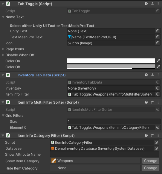
An Item Info Multi Filter Sorter runs its entries in list order. A Bag setup might first restrict Show Item Collections to Bag, then use an Item Info Category Filter for Consumable or Weapon. Sorters can compare name, amount, category name, or one named attribute.

Filtering and sorting change the view, not the Inventory contents. A one-time dropdown sort changes indexed positions; a bound sorter transforms the list on each draw. If manual gaps and continuous sorting conflict, decide whether the grid should preserve positions (Use Grid Index on) or present a continuously ordered list (off).

See Item Info Filter and Sorters for the built-in options and custom extension points.

Add tabs

Choose Create Inventory Tabs under UI Designer’s Grid Tabs section. Each Tab Toggle receives Inventory Tab Data and can provide its own Inventory, Item Info filter, maximum count, disable behavior, and grid indexer.

A Weapons Tab Toggle configured with Inventory Tab Data and a multi-filter containing an Item Info Category Filter for Weapons.

For example:

  • All uses only the Bag collection filter.
  • Consumables adds the Consumable category filter and shows Health Potion.
  • Weapons adds the Weapon category filter and shows Iron Sword.

The Inventory Grid Tab Control Binding switches the filter and tab indexer, then schedules a redraw. Reset Tab Index On Reset Draw and Select Slot 0 On Change Tab are both off by default. Enable the second option when changing tabs must always establish a valid selection for descriptions or Item Actions.

An Inventory Tab Data Inventory reference can switch the entire source Inventory for that tab. Leave it empty when every tab is only another view of the same Bag.

Configure navigation and input

UI Designer’s Grid Navigation supports None, Buttons, Scroll Step, and Scroll View. Choose vertical or horizontal navigation and optionally link reaching a tab boundary to the Tab Control.

The navigator changes the Item Info Grid’s start index; the fixed slots stay in place and redraw a different slice. ItemViewSlotEventData.SlotIndex is the local visible slot, while ItemIndex includes the grid’s current start-index offset.

Next/previous tab input comes from the Display Panel’s owner and is accepted only while that panel is selected. For local multiplayer, verify the correct Panel Owner, Inventory Identifier, EventSystem, and player input rather than sharing one grid between players.

Add actions, descriptions, and movement

Inventory Grid is an Item View Slots Container, so the shared UI Designer options apply:

  • Add an Item Description binding to show Health Potion or Iron Sword details when selection changes.
  • Add an Item Action Set or Category Item Action Set binding to offer Use, Equip, Drop, or another supported action.
  • Add the Cursor Manager, Drop Handler, Drop Action Set, and Drag Handler for pointer movement.
  • Add Item View Slot Move Cursor for keyboard/controller movement.

Selection and click operate on the visible slot’s current ItemInfo. When an Item Action or move changes the Inventory, the Inventory update schedules a new grid draw. See Move Items (Drag and Drop) for the complete transaction setup.

Use an Item Shape Inventory Grid

Use Item Shape Inventory Grid when one Item must occupy multiple cells in an Inventory-backed grid. It adds Item Shape data, controller, binding, and specialized Item View modules; setting a standard Inventory Grid to a larger slot size does not provide shape occupancy rules.

How it runs

  1. The Item Info Grid initializes its Grid Event System, creates or reuses Grid Size.x * Grid Size.y Action Buttons, and initializes the Item View Drawer.
  2. The panel binding assigns the Inventory and Display Panel to the Inventory Grid.
  3. Inventory Grid starts from Inventory.AllItemInfos, applies the active filter/sorter, then applies indexed ordering when Use Grid Index is enabled.
  4. Item Info Grid stores the resulting sequence and draws only the range from its start index to its end index.
  5. The Item View Drawer clears/reuses or replaces Item Views for the fixed slots.
  6. Selection, click, pointer, and drag events flow from Grid Event System to Item Info Grid and then through the Inventory Grid’s Item View Slots Container events.
  7. Inventory updates schedule another draw; multiple matching grids can copy index data before redrawing.

The Inventory Grid’s Draw() is deferred by the container until LateUpdate. ForceDraw() performs the container draw immediately, while Grid.Draw() draws the currently supplied ItemInfo sequence immediately.

Editor checkpoint

Before entering Play Mode, confirm that:

  • the generated panel belongs to the project schema, not package assets;
  • the Inventory Grid references its Item Info Grid;
  • Grid Size matches the intended number of slots and the Grid Layout Group constraint;
  • Grid Event System has a compatible Button Prefab, Content, and Grid Layout Group;
  • Item View Drawer has the intended Category Item View Set;
  • the panel binding resolves the character’s Inventory;
  • a Bag-only grid has an Item Collection filter for Bag;
  • every tab has Inventory Tab Data and the intended filter chain;
  • the Grid Navigator references this Item Info Grid and its controls;
  • Item Action and description bindings target the same container; and
  • drag or non-pointer movement has every required cursor/drop component.

Verify in Play Mode

  1. Open Bag and confirm slot 0 is selected and the correct character’s Items appear.
  2. Add Health Potion and Iron Sword to Bag. Both should appear once, while equipped or hidden collections remain excluded.
  3. Page or scroll beyond the first visible range, then return. Selection and the Item Description should match the newly visible ItemInfo.
  4. Switch between All, Consumables, and Weapons tabs. Health Potion and Iron Sword should appear only in the expected results, with no stale slot content.
  5. Search for sword, clear the search, and confirm compact search results return to the previous indexed layout.
  6. Sort by name or amount and verify whether the configured one-time or bound behavior is retained on redraw.
  7. Move Iron Sword to an empty visual index, close and reopen the panel, and verify the configured reset/compaction behavior.
  8. Drag Iron Sword to a valid Equipment slot and confirm the Inventory transaction updates both panels. Reject an invalid drop without losing the Item.

Save and network boundaries

Save the Inventory contents with the Inventory save workflow. Add Inventory Grid Saver when indexed positions—and each tab’s indexer—must survive a save/load cycle. That saver stores grid index data, not the Inventory itself, current selection, current tab, search text, or panel focus.

Inventory Grid Index Data shares positions between matching grids during the current runtime. It is not a replacement for Inventory Grid Saver across sessions.

Version 1 Inventory Grid does not replicate Inventory changes or grid ordering. A networking layer must authorize and synchronize the underlying Inventory transaction. Refresh the local grid after synchronized data arrives, and synchronize visual index data separately only if every client must see the same manual layout.

Troubleshooting

  • The grid is empty: Check the panel binding’s Inventory source, then remove filters temporarily. Inventory Grid reads Inventory.AllItemInfos before filtering.
  • Equipment Items appear in Bag: Add or correct Item Info Item Collection Filter and include only Bag in Show Item Collections.
  • The wrong player’s Inventory appears: Check Panel Owner, Bind To Panel Owner Inventory, explicit Inventory, and Bind To Inventory By Identifier.
  • There are too few or too many slots: Set Grid Size before Play Mode and confirm Grid Event System Content and the Grid Layout Group constraint match it.
  • Empty slots disappear unexpectedly: Check Set Real Element Count As Max and Disable Element Option.
  • Sorting appears to be ignored: Check Use Grid Index. Indexed ordering can intentionally preserve manual positions; disable it for a continuously sorted list or use a one-time index sort.
  • Changing tabs leaves no valid description: Enable Select Slot 0 On Change Tab and confirm the selected tab has Inventory Tab Data.
  • Next/previous tab input does nothing: Confirm the grid has a parent Display Panel, that panel is selected, its owner supplies player input, and the input names match Next and Previous or the configured replacements.
  • Dragging raises events but no Item moves: Draggable only forwards pointer events. Add and configure the Cursor Manager, Drop Handler, Drop Action Set, and Drag Handler.
  • Items move visually but return after loading: Add Inventory Grid Saver and ensure the Inventory itself loads before grid index data is restored.
  • Two grids unexpectedly share positions: Give them different Grid IDs or leave Grid ID at -1; matching Inventory, Grid ID, and tab ID share ordering.

Developer details

  • InventoryGrid.Grid, GridID, TabID, FilterSorter, UseGridIndex, and InventoryGridIndexer expose the current grid state.
  • SetInventory(Inventory) changes the source and registers for Inventory updates.
  • FilterAndSortItemInfos(bool notify = true) returns the sequence that will be drawn and optionally notifies matching grids.
  • BindGridFilterSorter(IFilterSorter<ItemInfo>) returns the previously bound filter/sorter. SortItemIndexes(Comparer<ItemInfo>) changes the indexer’s order.
  • RemoveEmptyIndexedItems() compacts the indexer. MoveItem(sourceIndex, destinationIndex) swaps visual Item Stack indices and schedules a draw.
  • AddItem(ItemInfo, index) adds through the Inventory, records the returned Item Stack at the index, and schedules a draw. RemoveItem(ItemInfo, index) removes through the Inventory; the index parameter does not select a different collection.
  • Grid.StartIndex, Grid.EndIndex, Grid.SetIndex(...), and SlotIndexOffset describe the current visible slice.
  • Item Info Grid events include OnElementSelected, OnElementClicked, OnEmptySelected, OnEmptyClicked, and pointer/drag events. Container-level events remain available for shared bindings.
  • Grid Event System exposes unavailable-navigation events for all four directions, allowing navigators or tabs to respond when Unity navigation cannot move to another visible slot.