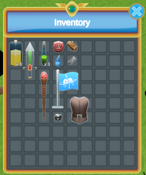
Item Shape Grid
Item Shape Grid may seem quite similar to an Inventory Grid at first but it is quite different in a few ways. The Item Shape Grid allows for items which take multiple slots in a finite grid. It allows any shape, it is not limited to rectangles.
To allow this functionality the Inventory itself must contain the grid data. As a result the Item Shape Grid requires a bit more attention than the standard Inventory Grid.
You may create an Item Shape Grid very easily using the UI Designer Item Shape Grid tab.
The Item Shape Grid is split in two layers.
- Background Layer: This shows the squares the size of one cell in the grid. It can be used to show the item being selected or as a preview when dragging items. The preview and selection finds all the slots that the item occupies and enables/disables color filters.
- Foreground Layer: This layer show the item icon scaled to the appropriate size. It is not intractable (the clicks pass-through to the background layer).
Both layers use the same Item View which enables/disables the different components depending on its layer state.
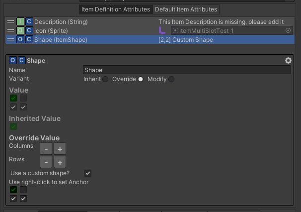
Attributes Define the Item Shape
The Item Shape allows you to define the size and shape of the Item within the grid. It uses a grid of boolean with an anchor. The anchor must be on an index which is “True”. The Item Shape can be set on items are Item Category/Definition Attribute. The rest of the Item Shape system will take care of using that information to place the items correctly:
Item Shape Grid Controller & Item Shape Grid Data
The Item Shape Inventory Grid Controller will determine whether an item can be added in the inventory depending on the state of all the Grid Data. To determine if an item fits or not it checks each Grid Data Item Collection ID and Filter as well as checking the Item Shape Attribute on the Items. The controller also chooses in which grid data the item will be added if there are more than one. The Item Shape Grid Data is the component which keeps track of where the item is in a grid. These components must be set next the the Inventory they affect.
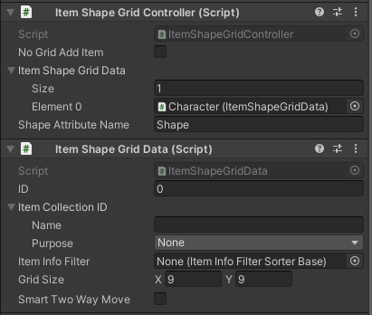
The Item Collection ID must be set to None if you wish to take into account all Item Collections. Otherwise the Grid Data may only take into account a single Item Collection. For example you may have two grid data: one for the main item collection and the other for your equipped items. The Item Info Filter can be used to restrict the type of items which gets added in the Item Shape Grid. Of course the Grid Size must match the Item Shape Grid Size in the UI.
Item Shape Grid
The Item Shape Grid is an Item View Slot Collection. It can easily be setup through the UI Designer (which also checks that your inventory grid data matches the UI size). The Item Shape Grid will use the information in the Grid Data (found by its ID on the bound Inventory) to draw the items in the grid.
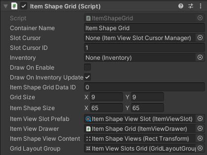
It’s important that the Grid Size matches between the Item Shape Grid and the Item Shape Grid Data.
The Item Shape View Content is the transform where the foreground Item Views will be spawned. The background Item Views will be spawned in the Item View Drawers Content like any other Item View Slot Container.
Whenever possible use the UI Designer to change the Grid Size or the Item Shape Size (Cell Size). This will make sure that all the components will be setup correctly (This might not work well with prefabs).
Item Shape Item View
For the Item View to display correctly in the Item Shape Grid some special Item View Modules are required. There are also some optional but extremely useful Item View Modules specific to Item Shape Grids. It is highly recommended to check the “Item View For Item Shape Grid” prefab in the Schema for an in depth look.
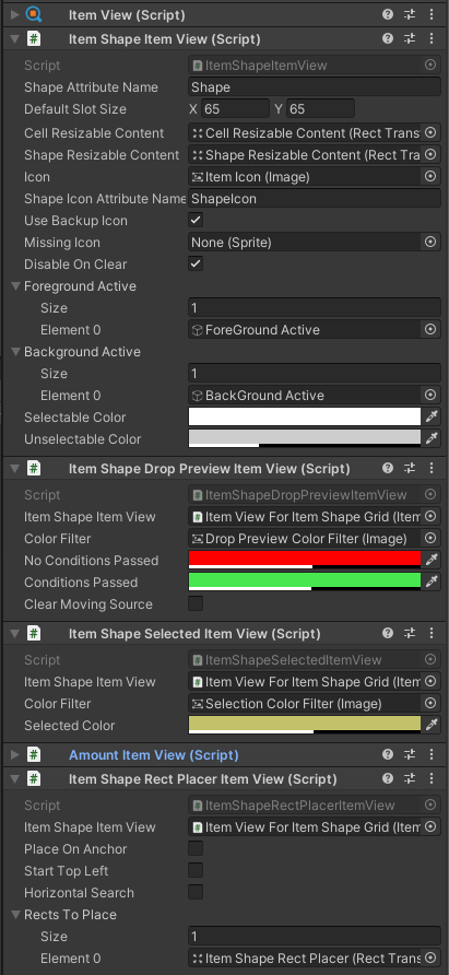
The following components are used:
- Item Shape Item View: The View Module is the main component for the Item Shape Item View. It is used to show the image of the item at the correct size. It also allows to scale transforms to the cell size or item shape size. There is also the option to enable/disable GameObjects depending on whether the view is set on the background or foreground layer.
- Item Shape Drop Preview Item View: A component used to preview whether the item can be moved by changing the color of some filter images of Item Views in the background layer. This allows the player to preview if an item can be dropped or not.
- Item Shape Selected Item View: This uses a similar technique as the drop preview color filter to show the selected Item by adding a color to the appropriate slots in the background layer.
- Item Shape Rect Place Item View: If you wish the add an amount in the bottom right of the item, it may be complicated if the item has a weird shape. This is where this component is very useful. It allows you to place a Rect Transform within the Item Shape by offsetting it in different axes depending on the shape and cell size.
- Canvas Group: The canvas group is important as it will be used to hide the image and disable interaction when necessary. For example the interaction is disabled when part of the foreground layer.