Item Shape Inventory Grid
Item Shape Inventory Grid is a special type of Inventory Grid which allows for items which take more than one slot in the grid.
Since it is a bit special compared to how the i Inventory Grid is usually used there are restrictions and requirements to make it work.
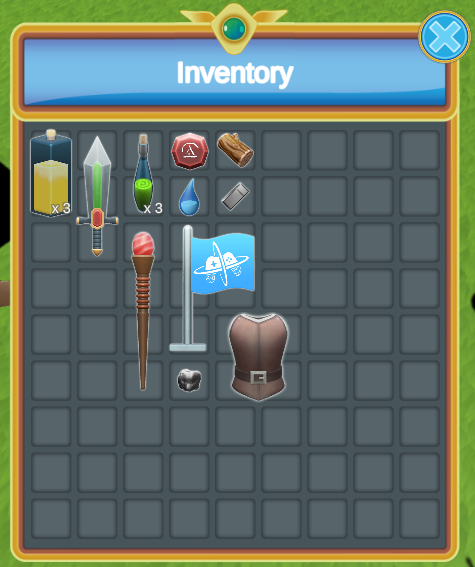
Note: In the example above the background grid is a simple tillable image background. It is aligned perfectly (by hand) to the Item View Slots. We are looking into improving this in the future.
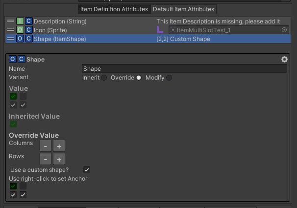
Attributes Define the Item Shape
The Item Shape allows you to define the size and shape of the Item within the grid. It uses a grid of boolean with an anchor. The anchor must be on an index which is “True”. The Item Shape can be set on items are Item Category/Definition Attribute. The rest of the Item Shape system will take care of using that information to place the items correctly:
Item Shape Inventory Grid Controller
The Item Shape Inventory Grid Controller will use the Item Shape Attributes on the Items to know whether or not they fit in different grids. The Item Shape Grid Data is the component which keeps track of where the item is in a grid. This components must be set next the the Inventory they affect.
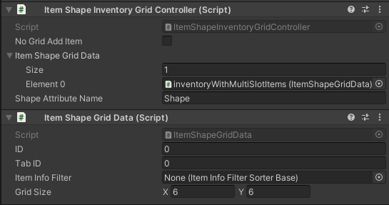
The ID and Tab ID can be used to differentiate the different grids. The Item Info Filter can be used to restrict the type of items which gets added in the Item Shape Grid. Of course the Grid Size must match the Inventory Grid Size in the UI.
Item Shape Inventory Grid Binding
The Item Shape Inventory Grid Binding sits next the the Inventory Grid component and it is used to bind the Item Shape Grid Data to the Inventory Grid to display the items within the grid.
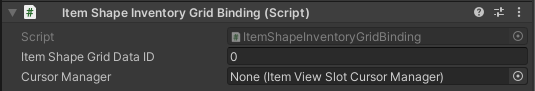
The Grid Item Shape Data Id can be used to specify which Inventory Item Shapes Grid Data should be used from the Inventory Item Shapes Grid Controller.
Item Shape Item View
For the Item View to display correctly in the Inventory Grid it must have some special Item View Modules.
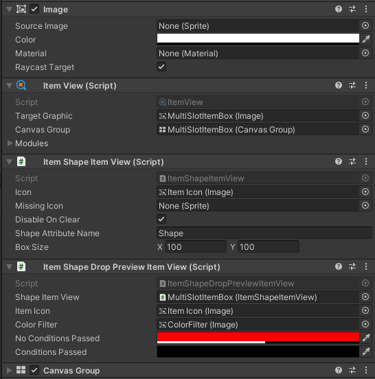
The following components are used:
- Item Shape Item View: A component used to show the image of the item at the correct size.
- Item Shape Drop Preview Item View: A component used to preview whether the item can be moved by swapping icons of the Item Views and changing the color whether the item can be moved or not.
- Canvas Group: The canvas group is important as it will be used to hide the image and disable interaction when necessary.