Inventory Grid
The Inventory Grid is used to display the content of an inventory. The Inventory grid can display lists and grids of items. To set these up efficiently it is highly recommended to use the Inventory Grid Creator in the UI Designer.
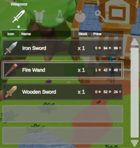
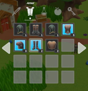
This page contains more information about the Inventory Grid component. The component is an Item View Slot Container and the documentation for the common edit options can be found on this page.
Create Options
When creating an Inventory Grid, a few options are available to choose from.
- Parent Transform: Choose the Rect Transform where the Inventory Grid will be spawned under.
- Panel Option : A few prefabs are available as Panels, the panel will be the parent of the inventory grid
- Basic : Just a simple Rect Transform with a Panel Component
- Simple: The panel has a header with a title
- Floating: The panel has a header with a title, the header has a drag handler component which allows the player to move the panel with the mouse
- Main Menu: The panel is specially made to fit inside the Main Menu. The parent Transform must be the main menu panel content transform
- Panel Name : The name of the panel. The Display Panel Manager can be used to get panels by name
- Inventory : You may set the inventory that the Inventory Grid will monitor
- Grid Options : There are a few types of Inventory Grids
- Grid : A simple Inventory Grid
- List : Makes an Inventory Grid will a single column and a scrollbar
- Inventory Grid Name : The name of the Inventory Grid can be useful in a few use cases, the most obvious one being drag&drop conditions
Grid Size & Layout Group
The grid size should be set from UI Designer such that the item view slots can be set correctly set to preview the grid size. The default Unity Layout groups are used to space out the item view slots. It is important to set it to know the directional axis of the grid.
The Layout Group Navigation is used to to easily set up explicit selectable navigation by checking only neighboring components. It uses the Layout Group to have information about the order in which the item view slots should be connected.
Grid Navigation
The Grid Navigator, not to be confused with layout group navigation, is used to show more items than the grid size can show. You may scroll through, page navigate, tab navigate, etc. It works both with mouse and with keyboard/controller.
Filters & Sorters
Filters and sorters can be added on the grid directly or swapped dynamically at runtime. Use the Default filters to set a default sorter/filter for the items displayed in the grid. Use the search bar to create a search bar that filters the grid whenever a user starts typing in it. Use the sort dropdown to sort the items within the grid at runtime.
Grid Tabs
Grid tabs are controlled by a Tab Controller and Tab Toggles. In the case of Inventory Grids, each type will have an Inventory Grid Tab Data which has a reference to the filter to use when that tab is active and more.