Inventory Grid
Grid UI and Grid Event System
When the Unity Scroll View loads content it loads an element for every list item without pooling or reusing elements. This is inefficient, so instead the inventory UI uses a grid where the number of buttons is fixed. When the items are displayed they are mapped to an index which is then compared to the index of a View. By moving the Index of the objects to draw up and down we can achieve an efficient scrolling.
The Grid Event System is used to detect any event from the buttons. The grid uses an Action Button class which allows for more event notifications than the standard Unity Button provides. The Grid Event System will invoke events when a button is selected, deselected, clicked, etc. It also invokes an event when the Unity Event System tries to move outside the grid. The Grid UI uses those events to scroll or even change tab.
Inventory Grid
The Inventory Grid is an Item View Slots Container, which uses the power of the Grid system for tabs, navigation and more. This is a perfect fit for displaying the content of an Inventory whether it is the Inventory of the player , shop, storage, etc…
An Inventory Grid can be setup and edited using the UI Designer Inventory Grid tab.
As an Item View Slots Container the functionalities such as Item Description, Item Action and more are easily accessible for the Inventory Grid.
To learn more about Item View Slots Containers see this page.
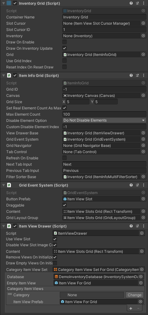
The Inventory Grid requires a few components to work: Item Info Grid, Grid Event System and Item View Drawer. These are the essential components but more are available to customize functionality of the Grid.

- Container Name: Used to differentiate Item View Slots Containers from one another.
- Inventory: The Inventory can be set directly in the inspector, or it can be set by code or using an Item View Slots Container Panel Binding
- Use Grid Index: Use the Grid Index such that the items remember where they were placed when moved, allowing empty spaces in the grid.
Useful API methods include:
// Get the Grid ID used to differentiate grids.
m_InventoryGrid.GridID

// Set the Inventory manually.
m_InventoryGrid.SetInventory(inventory);

// Sort the items in the inventory grid.
m_InventoryGrid.SortItemIndexes(itemInfoComparer);

// Bind a filter/sorter to the inventory grid (this can be done directly on the Item Info Grid).
m_InventoryGrid.BindGridFilterSorter(itemInfoSorterFilter);
Item Info Grid
The Item Info Grid contains all the Grid information about the Inventory Grid as well as define how and when the Grid should be refreshed. The Inventory Grid essentially controls the Item Info Grid.
There are some really useful fields on this component:
- Grid Size: The Grid Size, once initialized it does not change at runtime.
- Set Real Element Count As Max: If true the Grid element count will increase/decrease as items are added/removed in the Inventory. If false the Max Element Count will be used instead.
- Max Element Count: The maximum amount of elements that the grid can show. Can be used if the Grid has an element count unrelated to the number of items in the inventory.
- Disable Element Option: Choose if the ItemSlots should be hidden if they are out of bounds of the max element count.
- Custom Disable Element Index: The index at which the elments should start being disabled. This value is only used if the Disable Element Option is set the “Custom Disable Index…”.
Grid Navigator
Grid Navigators are used to navigate a Grid. For example, scrolling, paging, or scrolling with a scroll view. Use the UI Designer to set this up in no time.
Inventory Grid Tab Control Binding
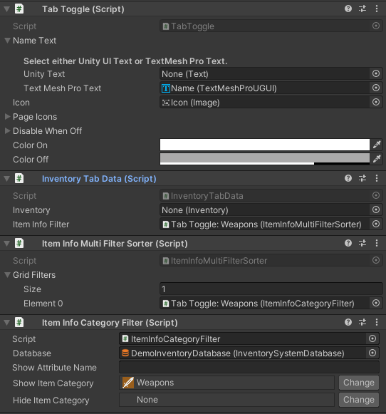
The Inventory Grid Tab Control Binding, binds a Tab Control to the Inventory Grid. It watches the Tab Toggles being turned on for an Inventory Tab Data component. The Inventory Tab Data component can have filters/sorters and more which will change what items the Inventory Grid shows

Item Info Filters/Sorters
Adding and removing Filters for the Inventory Grid is easy with the UI Designer. The list of available filter, even custom ones, will appear in the drop down when creating a new filter/sorter. Learn more about filter & sorters on this page.